Structure first.
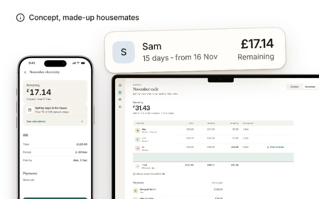
Interfaces feel lighter once the logic is sorted. In Household bills, everyone can see how their share was worked out.
See the project
A product designer with a curious mind and a playful spirit. At Connext, I design ERP software for groups of companies, for the moments when things don’t go to plan.
I studied Finance in Hanoi and FinTech in London before moving into product design. Today, I design software at Connext and explore other ideas through side projects.

I’ve always liked seeing where a new idea might lead. In design, that means exploring what technology makes possible, while holding onto the qualities that made me love digital experiences in the first place.
I’m drawn to things with character. A sense of familiarity, an unexpected detail, a little room to play. I bring that same sensibility to my work, with a fondness for expressive interfaces and the careful structure behind them.
My path into product design took me through Finance in Hanoi and FinTech in London. Today, I’m at Connext, designing tools for everyday work.
Interfaces feel lighter once the logic is sorted. In Household bills, everyone can see how their share was worked out.
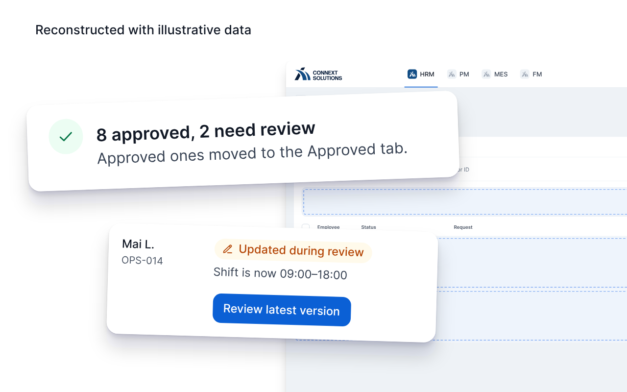
See the projectAt Connext, batch results show managers what went through and what still needs a look.
See the Connext workFor Headset recovery, a live prototype replays a device dropping out, so you can feel the recovery mid-call.
See the prototypeConnext - Remote / Hanoi
Designing ERP software for groups of companies, from the business rules to the finished, built interface.
When I’m not pushing pixels in Figma, I’m out enjoying experiences designed by wonderful restaurants. Because great design isn’t just on screens, it’s on plates too.


















Product Designer - London, UK
Connext - Remote / Hanoi
Designing ERP software for groups of companies, with a Design Lead, business analyst, product owner and engineers.
Aug to Oct 2026
Solo concept - service mapping and product design
Jun to Jul 2026
Solo concept - event-replay prototype built with Claude Code
Mar to May 2026
UX Designer and Team Lead - four-person concept team
Sep to Nov 2025
Product design and responsive interface prototype - with one developer
Sep 2023 to May 2025
Coventry University London - Distinction
Sep 2019 to Jun 2023
National Economics University - Distinction
The business analyst set the approval rules and sketched the main path. I designed how it works, and what managers see when part of a batch fails.

My part
Designed how bulk approval works on screen, from the confirmation step to the batch result.
Designed every state a stopped request can be in, and what each one lets the manager do next.
Handed it to engineering in enough detail to build, then checked the build.
Scope
The business analyst and product owner own the approval rules.
Requirement
Managers approve leave, overtime, attendance corrections, shift changes and any other request type a company sets up. Each step has a deadline. Once an attendance period locks, a late approval only reaches pay in the next payroll, so a request that quietly doesn’t go through can leave someone waiting a month.
The spec let managers select 1 to 20 requests on the current page, each rechecked on approval. Its wireframe ended with “Action complete”.

Flow
Bulk approval stays in the first list managers see. I renamed its tab from All to Pending, because it only ever holds requests waiting for them. A confirmation step comes first, because approving many at once is high-stakes.

Decision
The banner only counts. Each stopped row carries its own reason and the one action that still makes sense.

Trade-off
Once a request can stop mid-batch, the rest of the batch needs a rule.
Safe, but one edited shift holds up eight valid approvals.
Leaves the manager to hunt for the two that stopped.
Approve what passes, and keep the two that stopped in the list.
Recovery
Besides a lost connection, which only needs Try again, a request can stop for three reasons. For each, I decided what the row shows and where it leads.
An edited request can still be approved after review, so its row opens the latest version. A request that’s no longer yours to approve can’t go through, so it links to details instead. A date in a locked period, past its adjustment window, can’t be fixed in this flow, so its row only explains why. The steps follow the first case, with Mai’s edited request.

Open the latest version from the row.

Compare the old and new times, then decide.

Back on the same list, with Alex’s row still in place.

Patterns
I applied it to two other flows in the product, so engineering builds the pattern once.

Measures
I can’t test with users here, but the system already tracks what would tell us. Next time, I’d write these into the ticket from the start.
Once we agreed this design, the business analyst added it to the BRD as an acceptance criterion: a manager can tell which requests didn’t go through, why and what to do next, without opening any.
| Signal | Good sign |
|---|---|
| Overdue requests | Fewer when an attendance period locks |
| Late approvals | Fewer paid in the next payroll |
| Stopped rows | Dealt with in the same session |
Delivery
The confirmation step catches the manager’s own mistakes. It can’t stop a request changing afterwards, so the result screen does the other half.
The spec now documents this design. One rule is still open with the business analyst and product owner: partial results only hold if requests in a batch don’t depend on each other.

Written with our Design Lead and used across HR and admin.
| Pattern | Rule | In practice |
|---|---|---|
| Table | Keep the row identifiable | Sticky name column, aligned numbers |
| Form | Keep valid work when something fails | Error at the field, input kept |
| Feedback | Name the object and the next step | “2 requests need review”, linked |
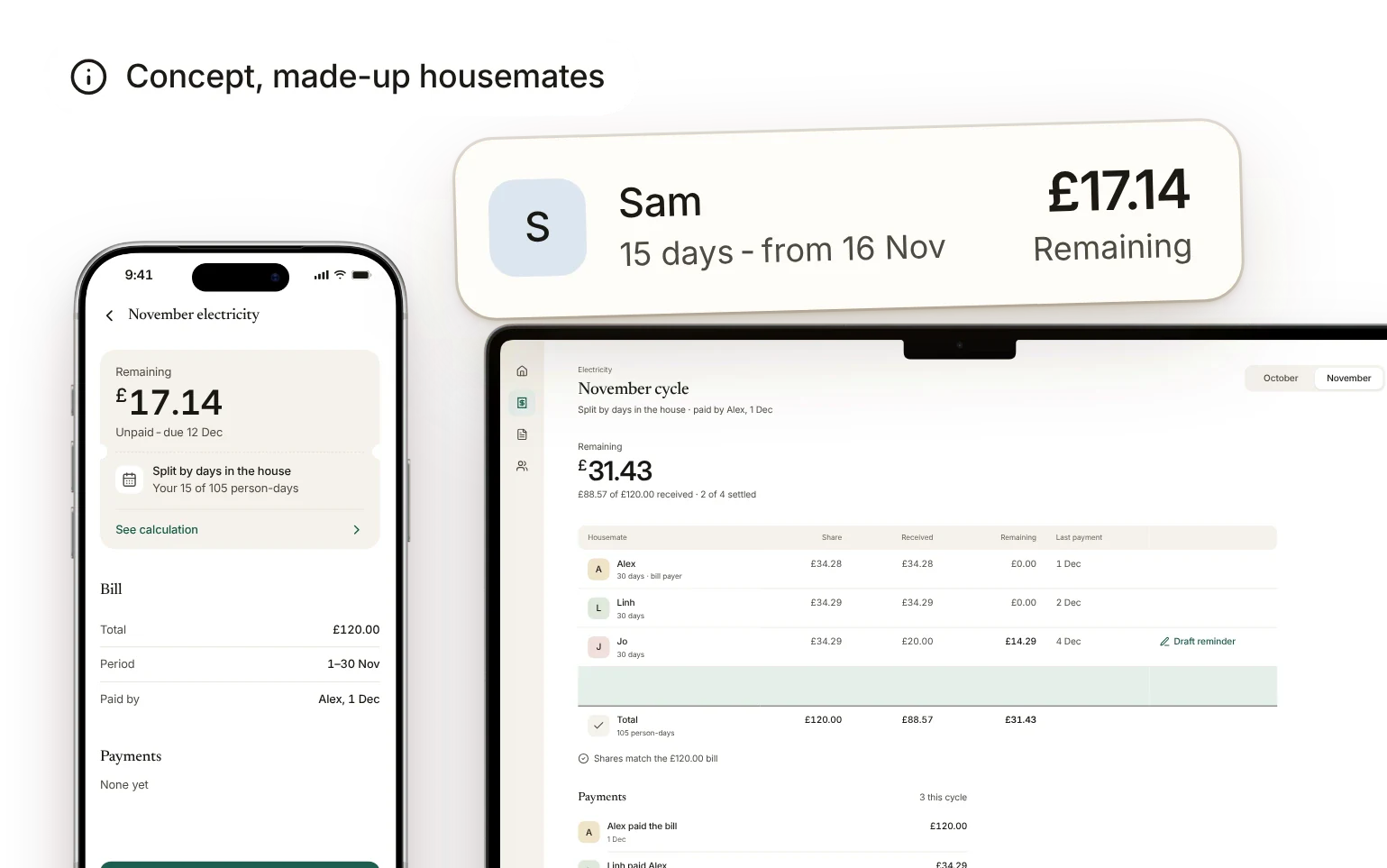
Sam moved into a four-person house halfway through November, so an equal split of the £120 electricity bill would charge him £30. In this concept, built with one developer, every share stays linked to the rule the household agreed.

My part
Shaped the billing model with the developer, from agreed rules to monthly cycles.
Designed the mobile share view, its explanation and the partial-payment flow.
Built the responsive cycle view with Claude Code, on top of the developer’s calculation module.
Scope
The developer built the calculation module, and payments, accounts and storage were out of scope.
Problem
Bills look simple until the household changes: a bigger room, someone away, a new housemate mid-month. The total in the group chat doesn’t say which of those were counted.
The bill payer needed a record they could explain without reopening the same conversation, and everyone else needed to see where their share came from.
| Detail | A total on its own | A share linked to a rule |
|---|---|---|
| Event | Sam moves in on 16 Nov | Sam moves in on 16 Nov |
| Rule | Not recorded | Split by days in the house |
| Amount | £30.00 each | Sam £17.14, 15 of 105 person-days |
Only the second says which rule produced the amount. The problem comes from my own time in a shared house in the UK, and the housemates here are made up.
Decision
I compared three models. An expense ledger, like most splitting apps, records each amount but not the rule behind it. Automatic collection needed payment infrastructure we couldn’t build. A household agreement with monthly cycles answered the question from the problem, where each share comes from, so every bill links to the rule that made it.
Changing the rule needs everyone to confirm, and it only applies from the next cycle. A settled month never recalculates, so its explanation stays true.

Calculation
My mockups showed tidy shares. On the real calculation module, rounding each share separately added up to £120.01.
We take the extra penny off the bill payer’s share, because they need the shares to match the real bill.
| Person | Days | Rounded share | Adjustment | Final share |
|---|---|---|---|---|
| Alex, payer | 30 | £34.29 | −£0.01 | £34.28 |
| Linh | 30 | £34.29 | £0.00 | £34.29 |
| Jo | 30 | £34.29 | £0.00 | £34.29 |
| Sam | 15 | £17.14 | £0.00 | £17.14 |
| Total | 105 | £120.01 | −£0.01 | £120.00 |
Someone away uses the same rule, with fewer days in the house. Room weights and meter readings are separate rules.
Explanation
Most visits start with one question: how much do I still owe? So the amount comes first and the calculation one step deeper, close enough to check if something looks wrong.


Payments
A partial payment stays against one person in one cycle, or the bill payer ends up doing the subtraction again.
Reminders became drafts the bill payer reviews before sending, so the app never speaks for a housemate or treats a delay like debt collection.

Result
The cycle view runs on the developer’s calculation module, so every amount on screen comes from the agreed rule.
| Check | Value | Result |
|---|---|---|
| Four shares | £120.00 | Match the bill |
| Rounding | £0.01 | Taken off Alex’s share |
| Sam’s days | 15 of 105 | From his move-in date |
Next, I’d check whether people can explain a mid-cycle share, log a partial payment against the right share, and tell a future rule change from a past cycle. The first bar is that most people explain Sam’s share on their own.
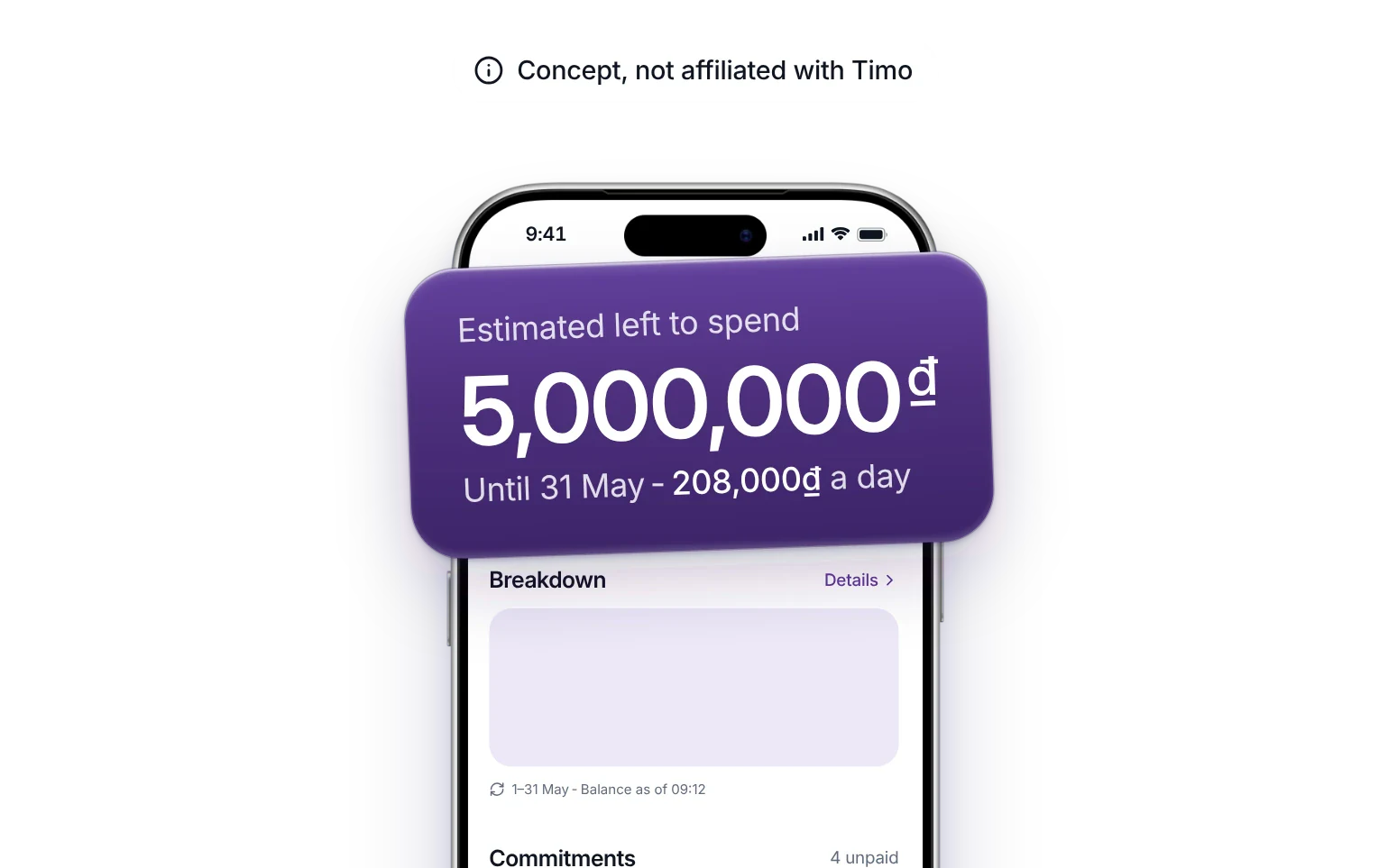
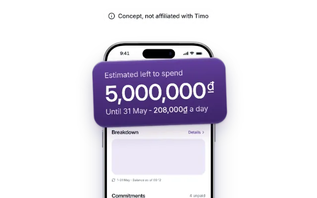
Young people in their first jobs told us payday feels like plenty, and by mid-month the money is gone. In a four-person course project, I led the scope and structure of our answer: a breakdown where the biggest number is what’s really left to spend.

My part
Led the scope and information structure for the team.
Designed the editable commitments and the purchase preview.
Built the prototype the team reviewed, using Claude Code.
Scope
Research was shared with Huyen, Thu and Khiem, and we chose the new direction together. The concept has no link to Timo or to real accounts.
Research
We interviewed 12 students and young workers in Hanoi and Ho Chi Minh City. Trouble came right after payday, or when something tempted them.
Spotting unplanned spending wasn’t frequent, but of the jobs 6 or more people raised, it was the hardest. Sometimes impulse won, like a family gift that beat the budget. Sometimes the warning came too late. So we focused on the moment the impulse wins.
“At the start of the month there’s money, so I spend freely. By mid-month I open the bank app and wonder where it went.”
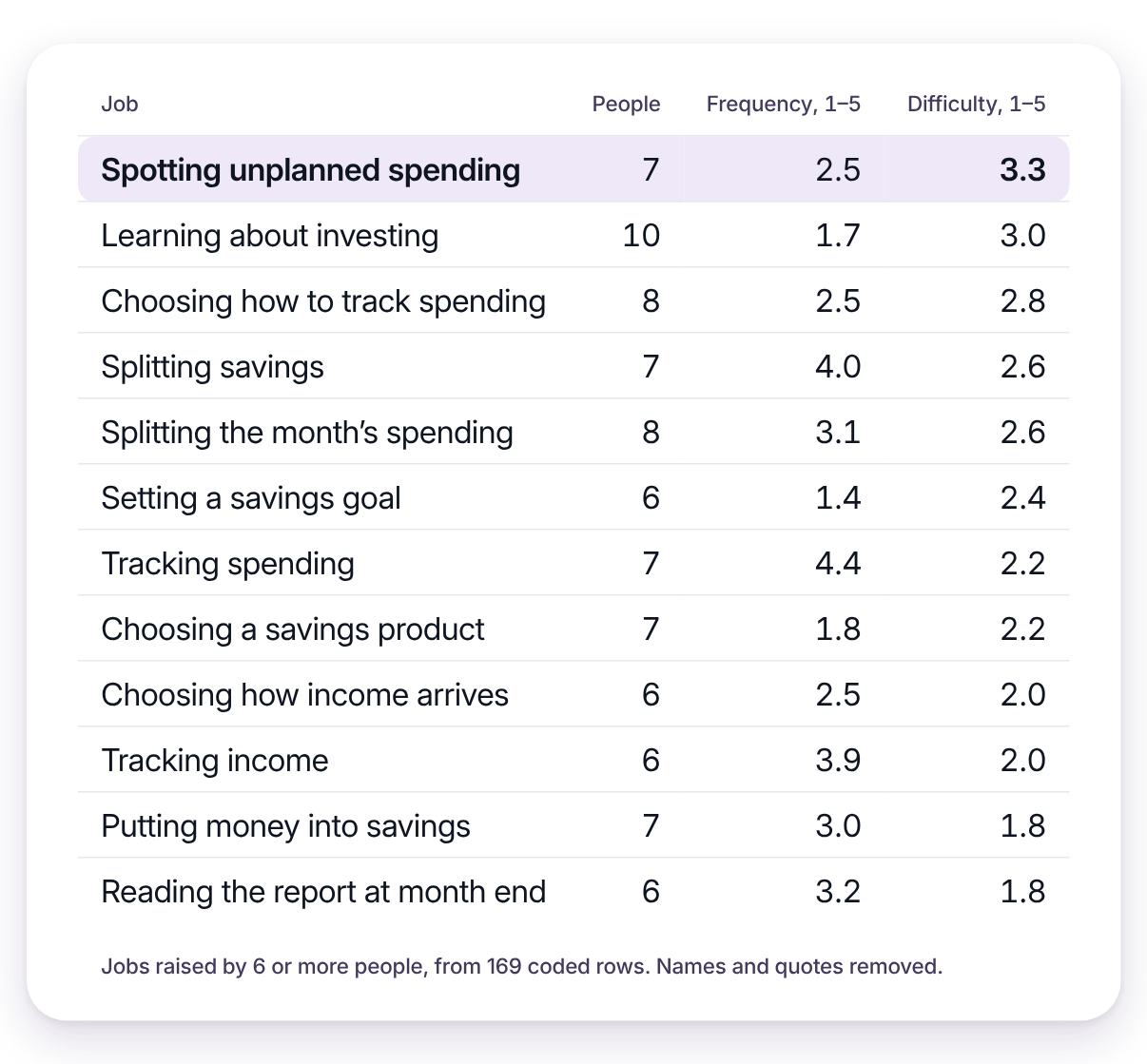
Four interviewees had already built their own spendable number by hand. Each method broke somewhere once spending started.
| What they did | Where it broke |
|---|---|
| Kept a separate account for spending | Limit set by feel, topped up by hand |
| Split pay in their head on payday | Nothing kept the split once spending started |
| Filled savings jars by feel | Only noticed overspending when a jar was nearly empty |
| Moved fixed percentages out, spent the rest | Couldn’t tell where the rest went |
Our audit of Timo, MoMo and Money Lover found all three show spending only after it happens. Two cities show patterns, not the whole country.
Root causes
Duong’s month is a loop that restarts every payday. Asking why at each pain point left two root causes.
The balance makes bills due later feel lighter than they are. At the moment of buying, the joy is vivid and the cost isn’t. Our first concept answered both.
Root cause 1
Payday feels like plenty
A high balance, so she spends freely.
Tempted while scrolling
Feeds and livestreams to unwind.
Root cause 2
Talks herself into it
The balance looks big, so no budget check.
Pays in a few taps
Happy now, regretful when it arrives.
Notices too late
Mid-month, she can’t recall where it went.
Cuts back, then plans again
Borrows until payday, then tries a new app.
Gives up
A few days later, and payday restarts it.
Root cause 1
70% in Vietnam would rather enjoy money now than worry about the future (UOB, 2025).
How might we show, right after payday, what’s really left to spend?
Root cause 2
91% in Vietnam say social media ads influence what they buy (PwC, 2024).
How might we show what a purchase trades away, and still leave room for the feeling?
Pivot
Future Self Fund locked away money for upcoming bills on payday, showed what was really spendable, and added a checkpoint that paused checkout before Buy now. A feasibility review ruled out both the lock and the checkpoint. Interviews made us doubt the checkpoint too, since people talk themselves into purchases once they want something.
So we kept the part that needed neither, a new number to anchor on, and put it where the bank app already reaches people.
| Layer | Can | Can’t |
|---|---|---|
| Phone OS | See when an app opens | See inside a shopping app |
| Open Banking | Read the balance, move money | Stop a payment |
| Shopping apps | Nothing we could rely on | Partner, since they earn from orders |


We lost a direct answer at checkout, since the preview only works if someone opens it. That’s a bet, and the first thing I’d test.
Decision
The balance caused the first root cause, so the estimate is read first. A bank can’t change the balance it shows, so the real balance stays visible, just not first.
We built on Timo’s jars, which most Vietnamese banking apps don’t have. The estimate only shows money and never moves it, so people keep control.

Commitments
Leaving to add something forgotten breaks the decision in progress, so Duong adds the wedding gift she promised a friend right in the breakdown.

Spot what’s missing.

Add it in place.

See what changed, then carry on.
Preview
Going ahead stays a normal action, and the preview never calls a purchase good or bad.

States
Fixing one missing commitment doesn’t make the number certain. Each unknown gets its own wording and next step.

Open
Do people trust the estimate? Does seeing it earlier change what they buy later in the month? And how does this meet the emotional need Future Self Fund set out to handle?
First test: after the breakdown, ask how much they can spend until next payday. It passes if most people, say 4 of 5, answer with the estimate and can say why. Then give them a purchase and see who opens the preview unprompted.
I also explored an AI explanation beside the breakdown, using the same model. It flags a missing commitment or an old balance and points to the input to check. It stays out of the main story because the prototype doesn’t yet show a question the breakdown fails to answer.
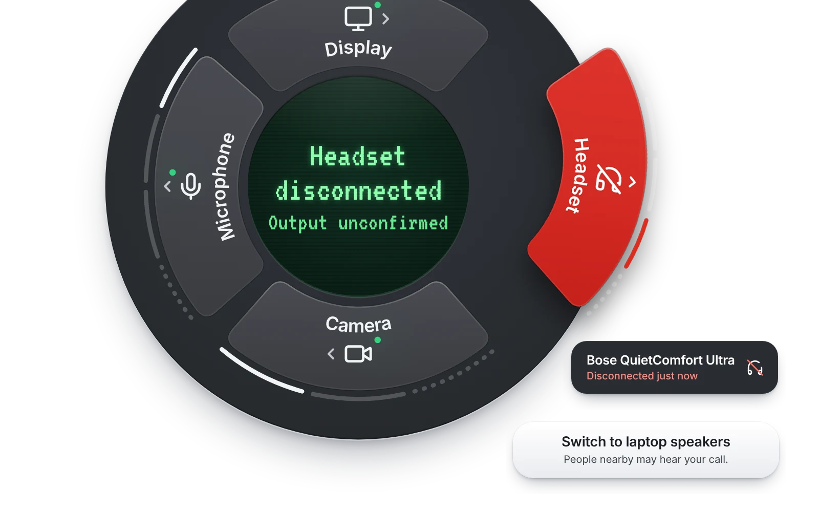
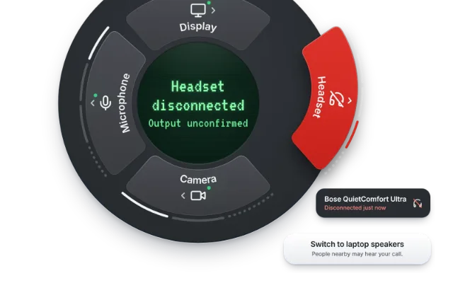
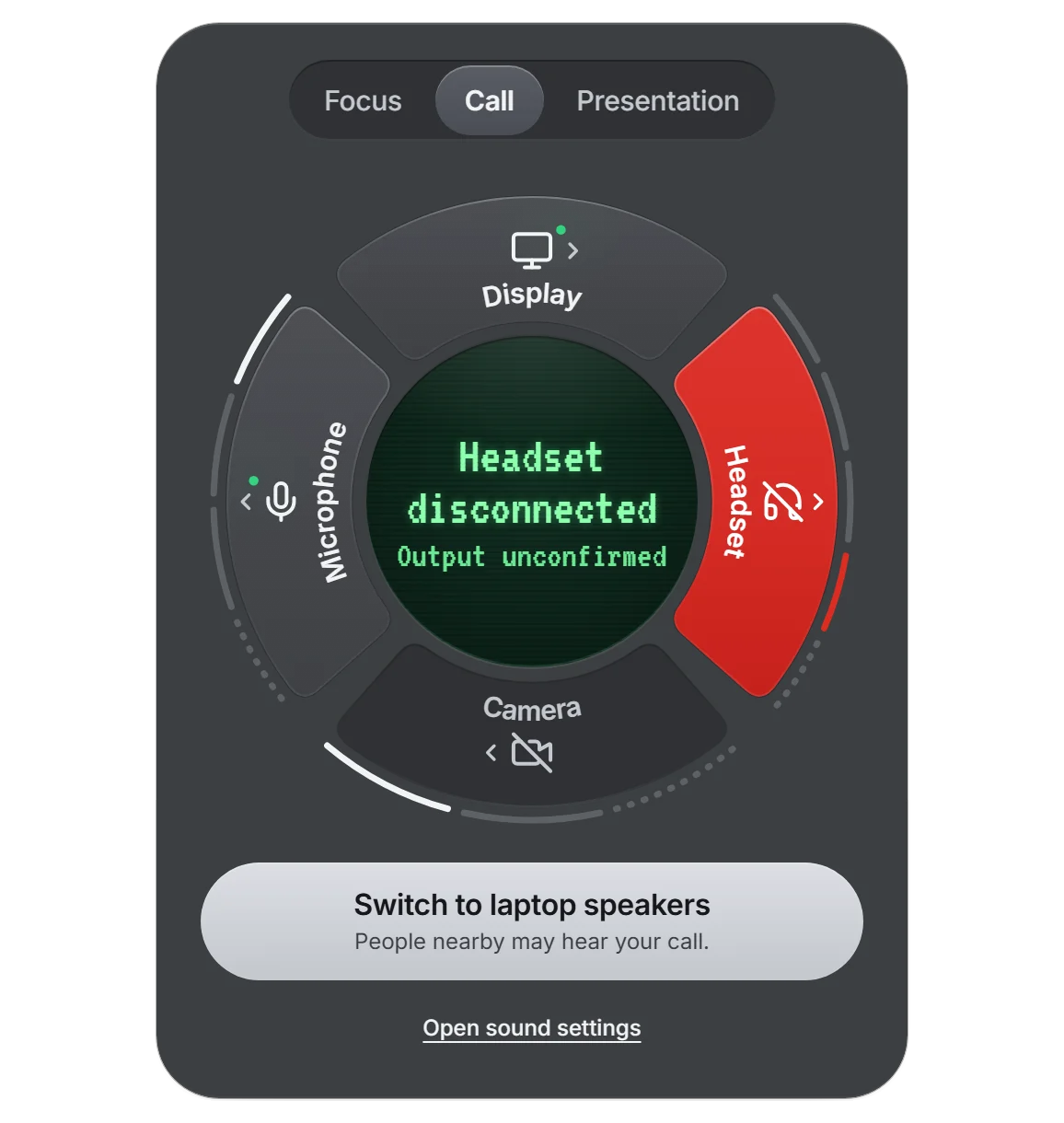
A small menu bar concept for switching a desk between focus, calls and presentations. It’s an example of designing states and recovery with a playable prototype, replaying what happens when a headset drops mid-call.
My part
Designed the ring panel, the change preview, device states and recovery.
Worked out the layout in wireframe drafts, changing one decision per draft.
Built a browser prototype with Claude Code that replays device events, including interruptions.
Scope
This is a solo concept, and nothing in it controls real hardware. Device names are real products, used as examples.
Drafts
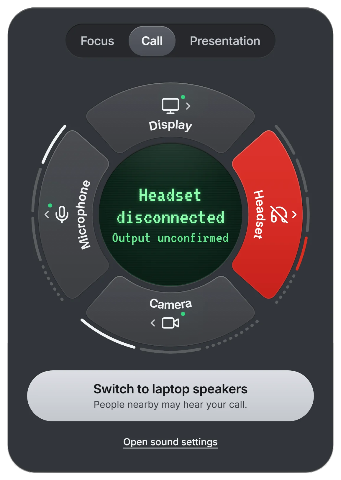
A dropped headset gets lost in a list of rows, so I moved the state onto a ring where the failure is one red segment. Each draft changed one decision, and the panel went from 940 px to 408 px.
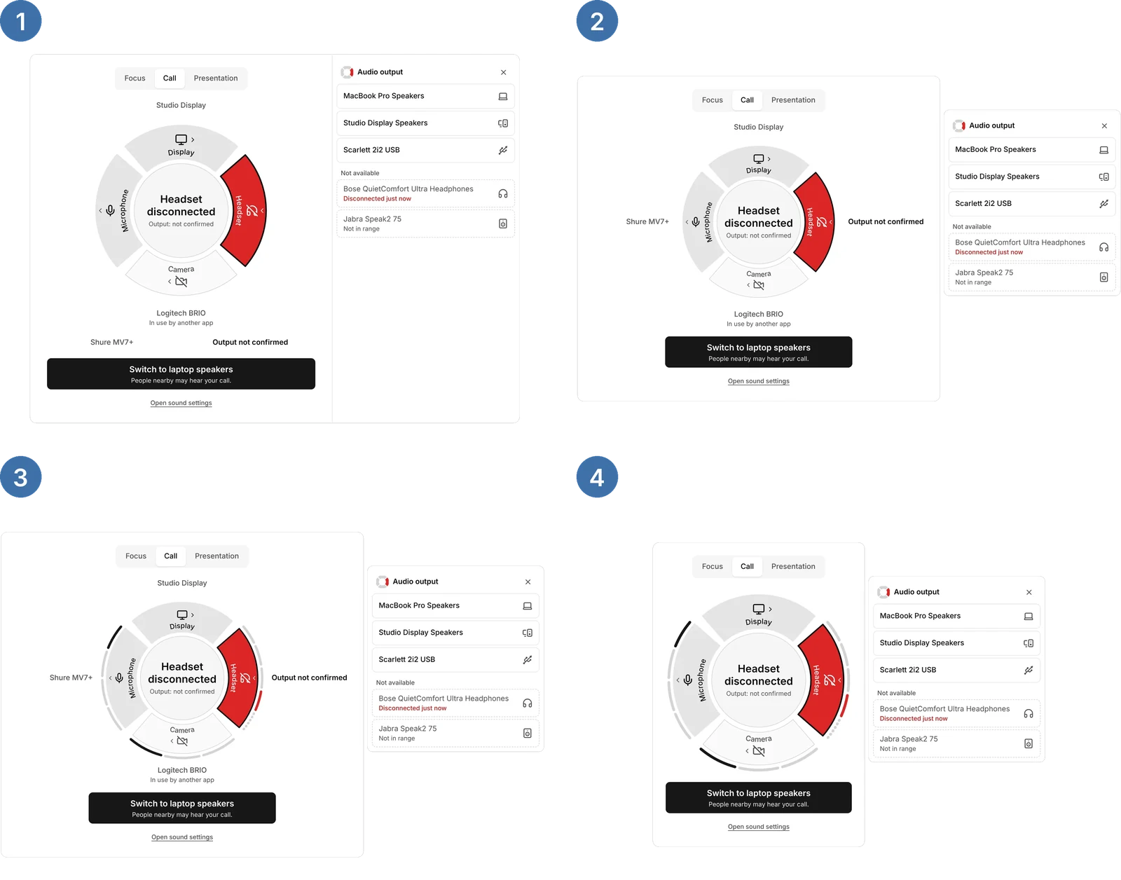
Readable at a glance, but each name competes with the failure.
Less to read during a failure, but the device in use is one step away.
Hover to read a name isn’t drawn yet, and only a test can settle this.
Decision
I kept the device, what it supports, the mode and the result of each attempt apart, so a Call label can’t look successful when only the audio switched.
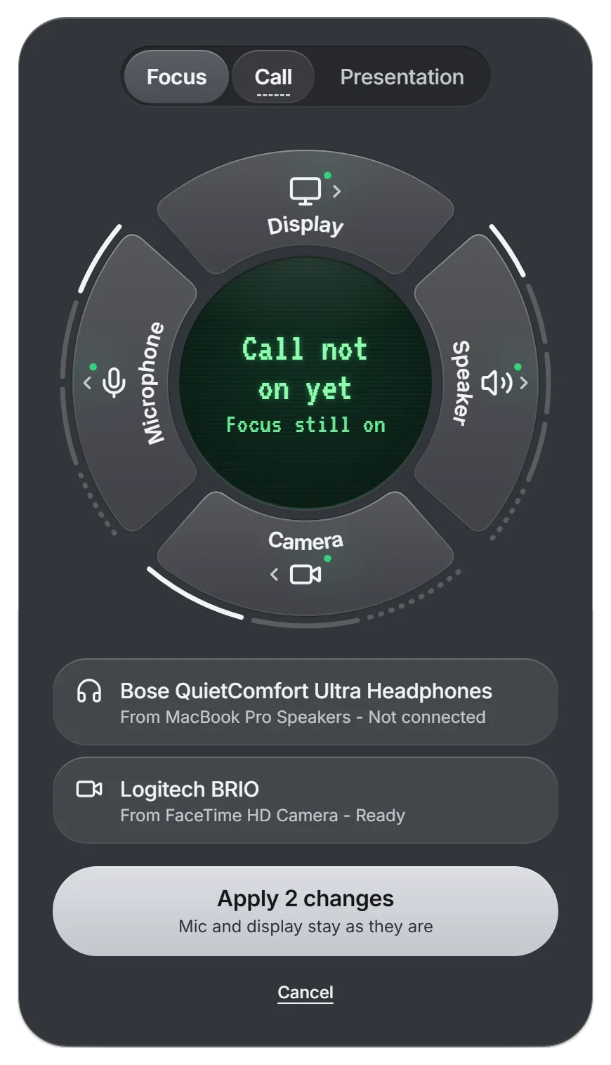
Recovery
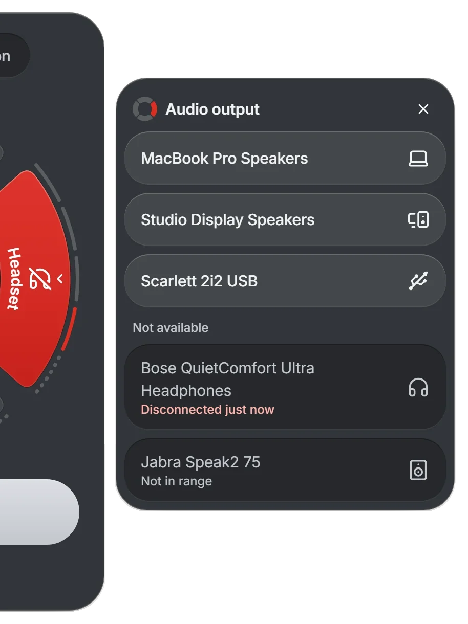
Switching to laptop speakers and opening sound settings are different actions, so they stay separate instead of one Retry. The display then waits for macOS before it says the output changed.
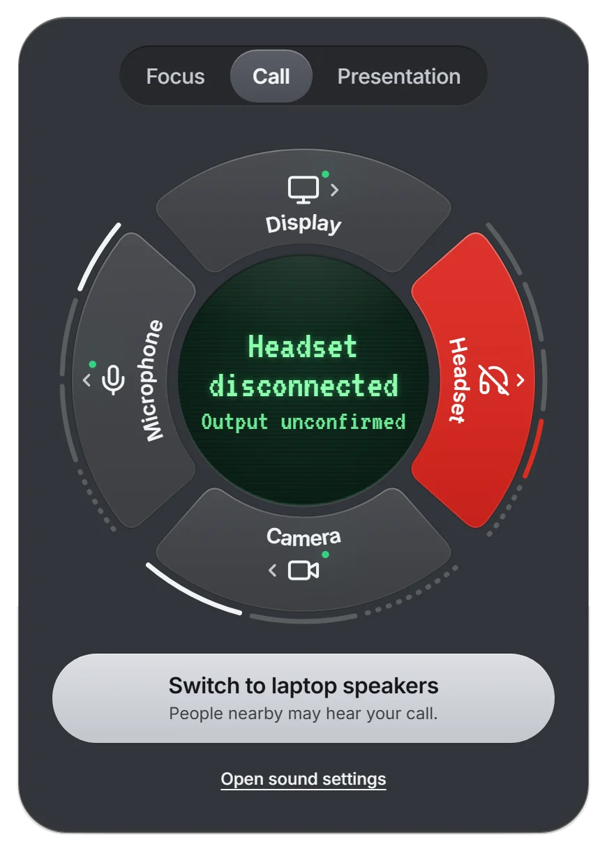
The headset drops, and the panel offers two separate actions.
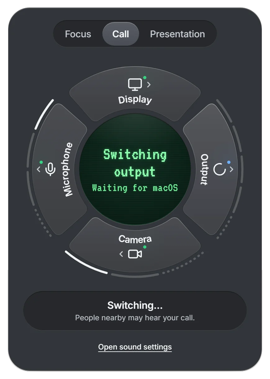
While it switches, the display says what it’s waiting for.
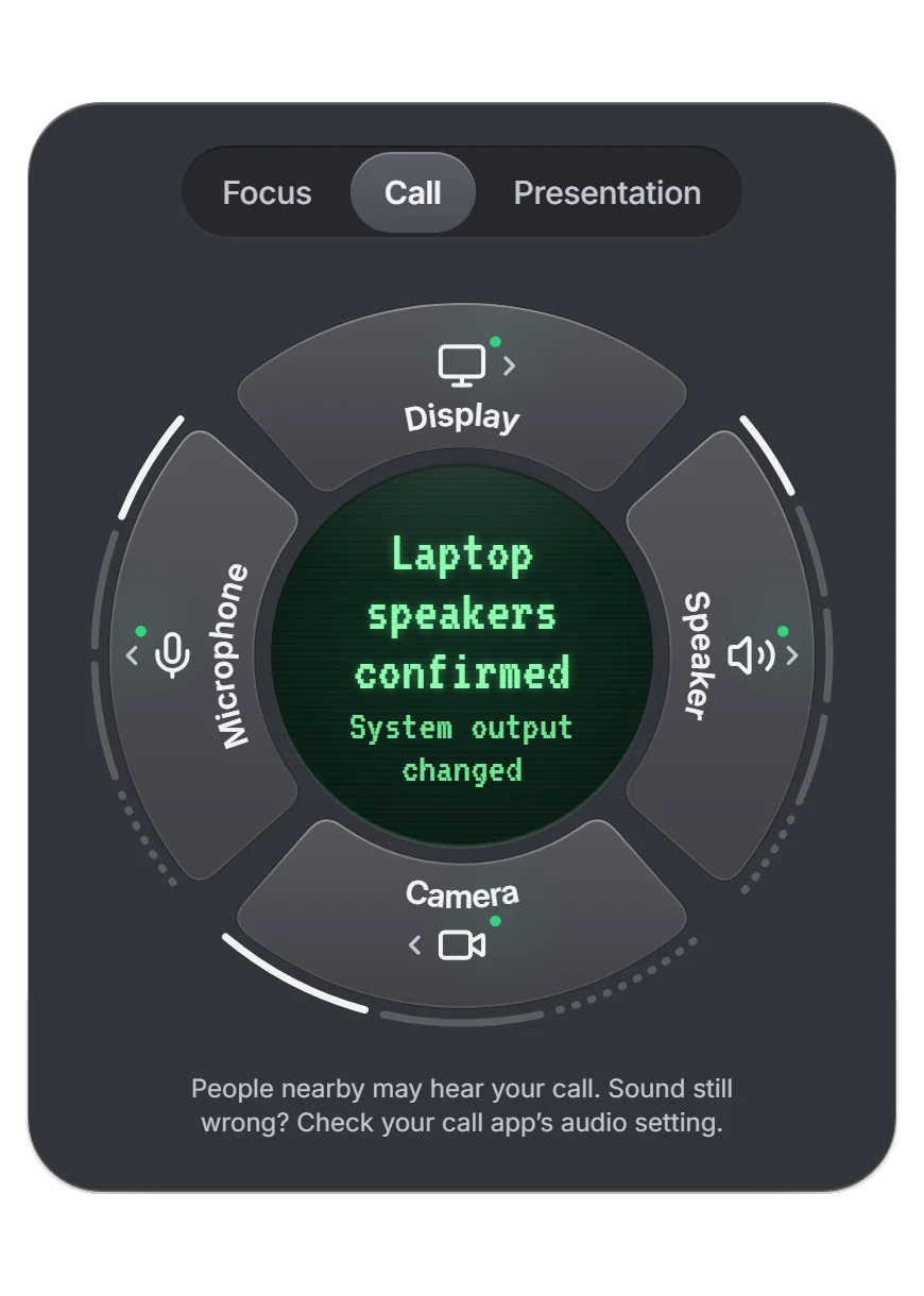
Once macOS confirms, the panel says where the sound goes now.
Proposed copy for the speaker option, which warns that people nearby may hear the call.
Edge cases
When the headset and the camera fail together, only the headset turns red, because it’s the one breaking the call right now. At a larger text size the panel grows instead of shrinking the text, and long device names wrap inside the popup.
| State | Shows | Offers |
|---|---|---|
| Connected | A green dot, and the pointer on the device in use | Change, from the popup |
| Working | A spinner, and what the display is waiting for | Nothing, to avoid a duplicate |
| Needs attention | A red segment, and what broke in the display | The relevant recovery |
| Not supported | Manual control only, on the device card | The right external control |
| Unavailable | A crossed-out icon, and why on the device card | The reason stays visible |
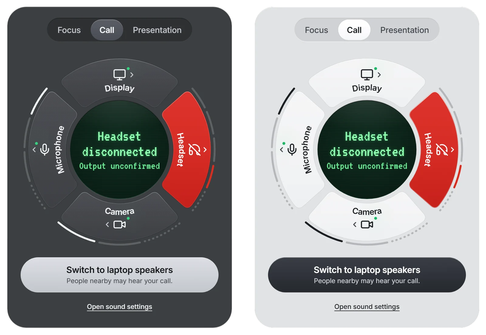
I also made a landing page and store-style images for the concept. They’re presentation assets, not evidence of a released app.
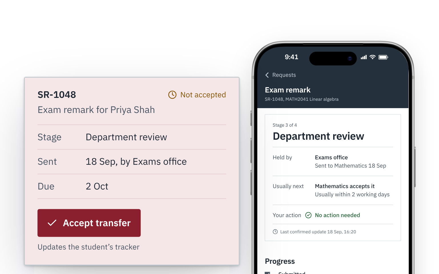
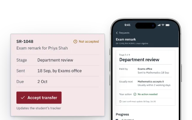
A student request can move between several offices while its status still says “processing”. This independent concept follows one exam-remark request, SR-1048, through those handoffs and links what the student sees to the staff action that makes each update true.

My part
Mapped how an exam-remark request moves across the offices involved.
Designed the shared case model, the student tracker and the document checklist.
Designed the office queue so handling a case updates the student view.
Scope
The university would own the policies the concept depends on, including who accepts each handoff.
Decision
SR-1048 sat in the department, unaccepted, while its status said “processing”. In the proposed workflow, a transfer stays visible to the sending office until the receiving office accepts it.
I had no access to a real university’s process, so the current steps are an assumed baseline.


Office side
A timeline is only useful if the office keeps it accurate, so accepting SR-1048 is the same action that moves the student’s tracker.

The department accepts SR-1048.

The student sees the confirmed stage.
Before any of this is built, the university would need to settle who owns each handoff, whether a processing time is a commitment, and which steps can stay online.
The page may have moved. You can return to the work and find your way from there.